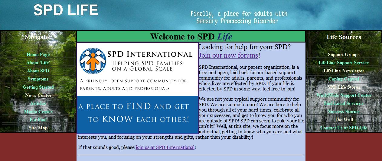
Learn About Our New Site Design
SPD Life Has Changed Its Look!
Hello to all of my long-time followers and people who have continued to remain with me on this journey to build the first online resource center specializing in adults with SPD. As I am a budding web developer, I have learned a good deal since I first designed this site in December 2008. With all that I have learned, I have decided that the old design just was no longer cutting it. I have spent a few months now gradually redesigning this site with the new layout. I hope you enjoy the new site!
New Features
There have been a number of new features implimented to the site. The biggest of these is the new design and layout. As you'll see, the site has gone dark! Why so dark? Well, a lot of people with Sensory Processing Disorder have a good deal of trouble with bright light, so I changed the site from dark text on a light background to light text on a dark background. Overall, the responses have been very positive, that the new look has been quite helpful for many people. Alternate things (and the ability to choose them) is in the works though.
The site has been reorganized! For starters, the old home page, which was quite lengthy, has been moved to the SPD Information page on the site navigation menu. "The Wall" and "Coping Central" have been renamed and moved to the new Tips and Advice section of the site. The SPD Symptoms Checklists have been moved to the new SPD Information section, as have the old Senses Central (Impact on the Senses) pages.
New pages have been added. We now have a Find Support page that can point you to some of the best support resources in the adult SPD world. The Our Forum page offers you an exciting ability to get to talk to other adults with SPD and get real life support right now! Just read the page to find out where, and yes, I'll be there. Our Donations page is also new, offering you a quick and easy way to help support us and keep us running.
A few new specific pages have been added as well:
- Dan's Story, Part II - rest of the story I wrote a couple years ago.
- SPD For Dummies, Part I - a humorous introduction to SPD by Paul Balius.
- Contribute Content - a quick and easy way to submit your own content to be added to the site.
- SPD Resources - helpful information and documents that are available to download for free.
Features Removed
Sadly, several things needed to be removed from the site in order to make it more functional and less of a 'tease.' Yes, there used to be links on the navigation and displayed prominantly throughout the site to such features as news, services locator, and newsletter. These were all projects I was going to undertake when I first launched the site, but never had the time or ability to follow through on. I decided it is not good to even list those things if nothing is going to happen in those areas. For that reason, I have removed those from the site.

The features that were removed, however, can still be found! If you are wanting news or any sort of regular updates, feel free to join our new free forum site at SPD International. There, I, as well as several others, are already filling each other in on the newist happenings and sharing our own triumphs and tribulations in an effort to support and get to know each other.
I am not completely giving up on creating the Services Locator page either. I have merely removed it because there are only two entries on it so far! If I can get more names signed up to it, then I may put the list back up. For now though, if you are looking for an occupational therapist or other professional, you can always seek help on our SPD International forums, or by finding them on the SPD Foundation's website.
Future Changes
Perhaps the most notable thing missing in the new version is the favorite 'Soft Mode' from the old site. The way that was being ran was incredibly ineffecient for me, and continuing to support it was nearly doubling the amount of time I had to spend on the site.
This is not a perminent removal though. I am developing a much cleaner, more concise way of conducting theme changes, and will launch it as soon as it's available. The best part about the new system, perhaps, is that it will allow me to have a list of alternate themes to view pages in, as opposed to only 2.
For now though, I am sticking with the new darker theme as the only one that is available, as people tell me that it does the trick of relaxing the eyes that the old soft mode did. People have actually told me that they prefer this more, but I would still like to make the other views available as soon as possible. Hopefully, I can get that running by the summer of 2011.